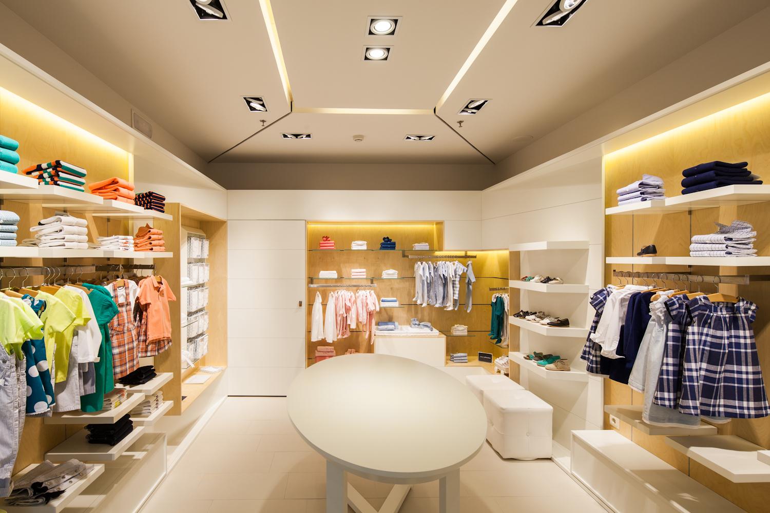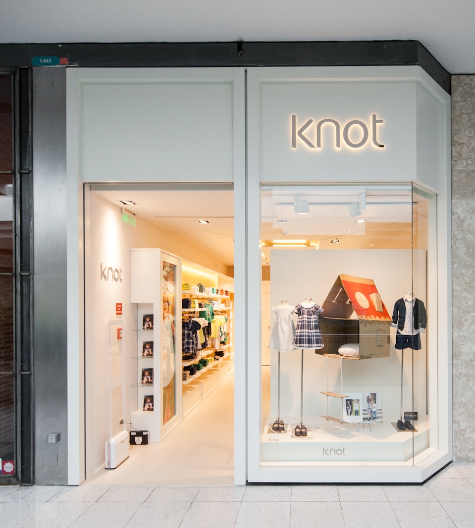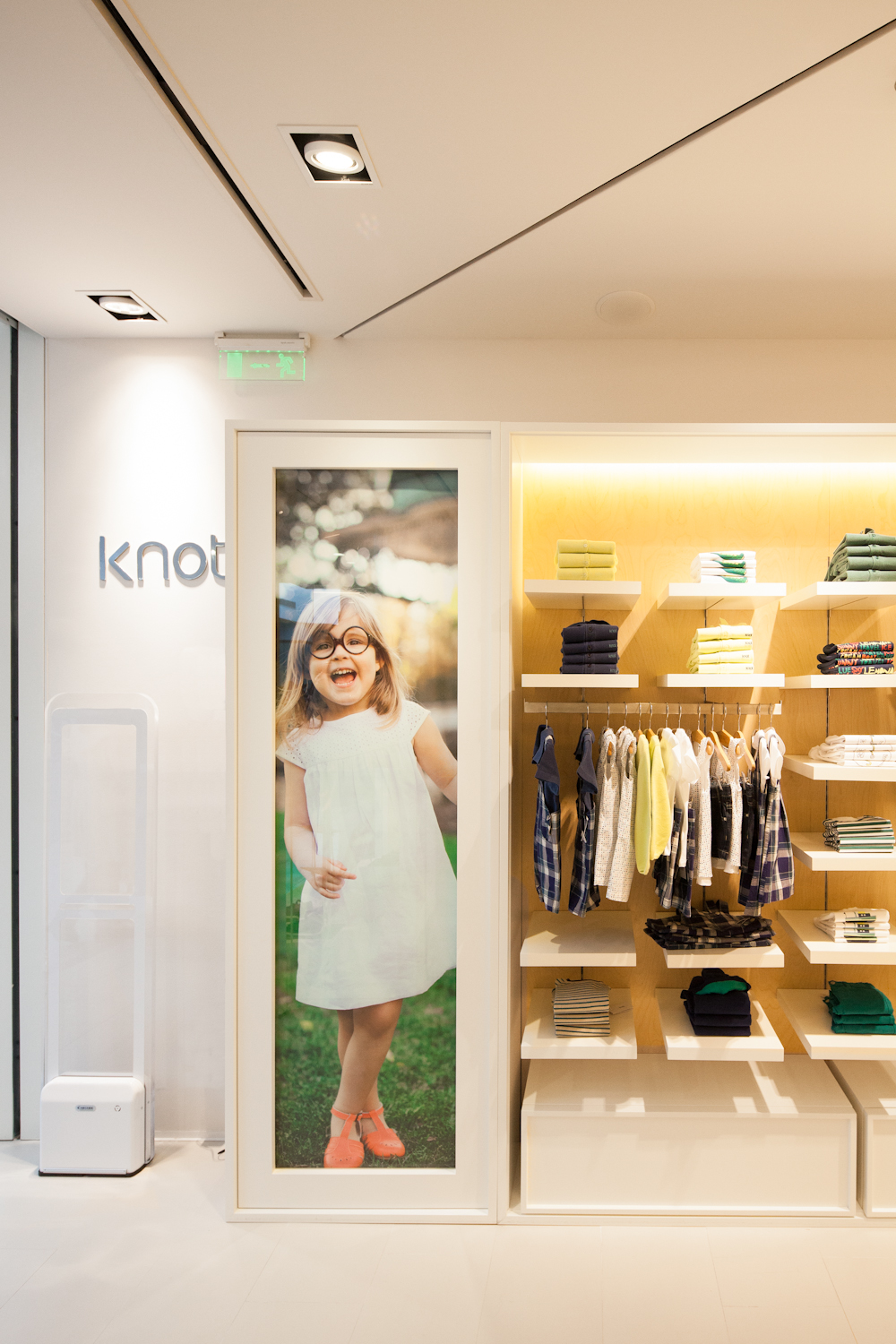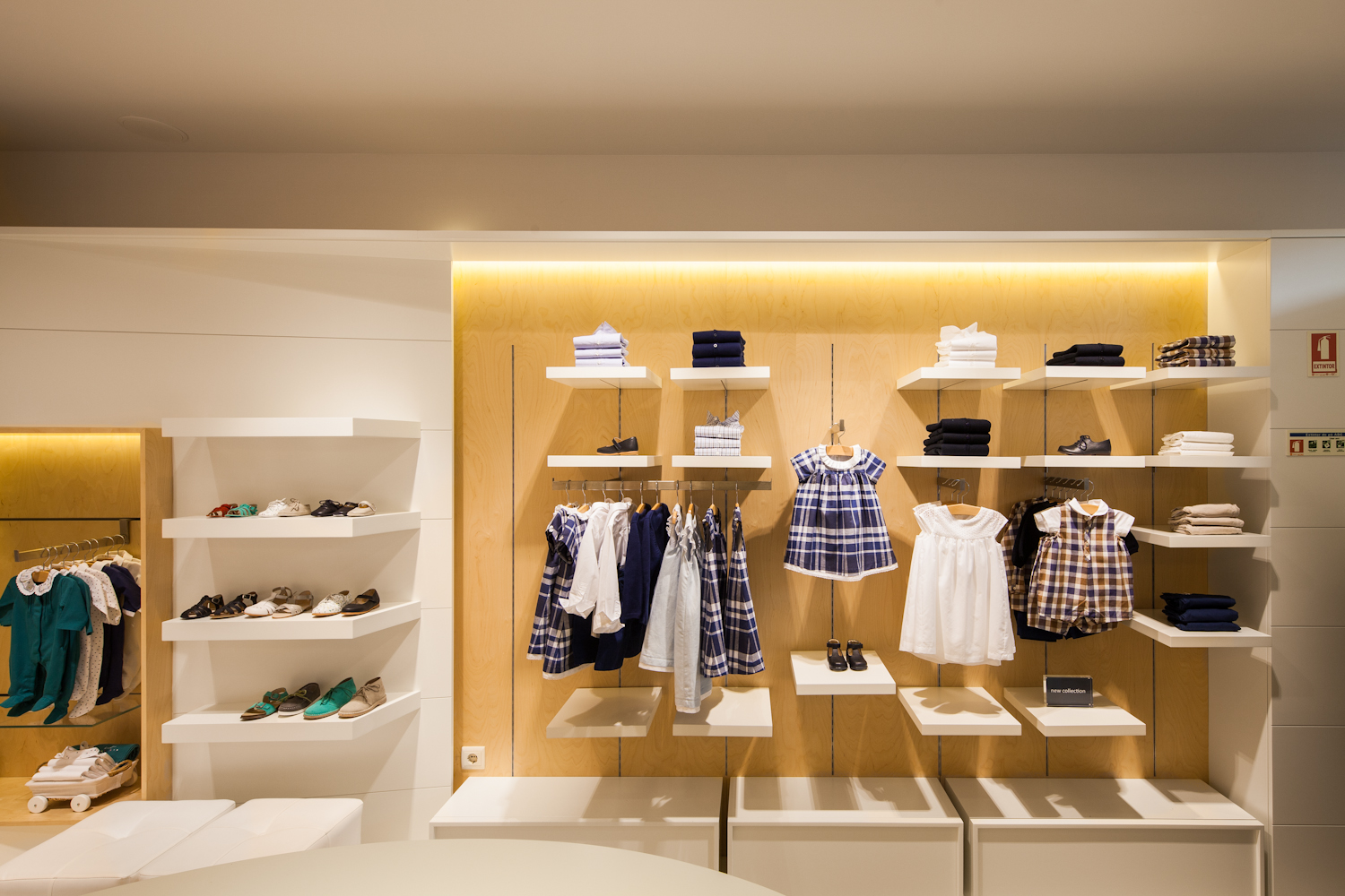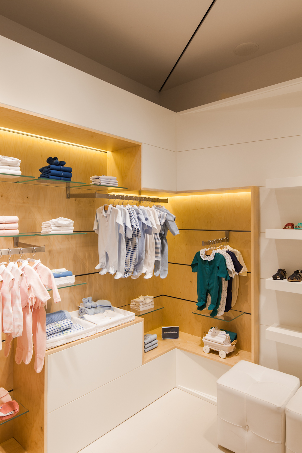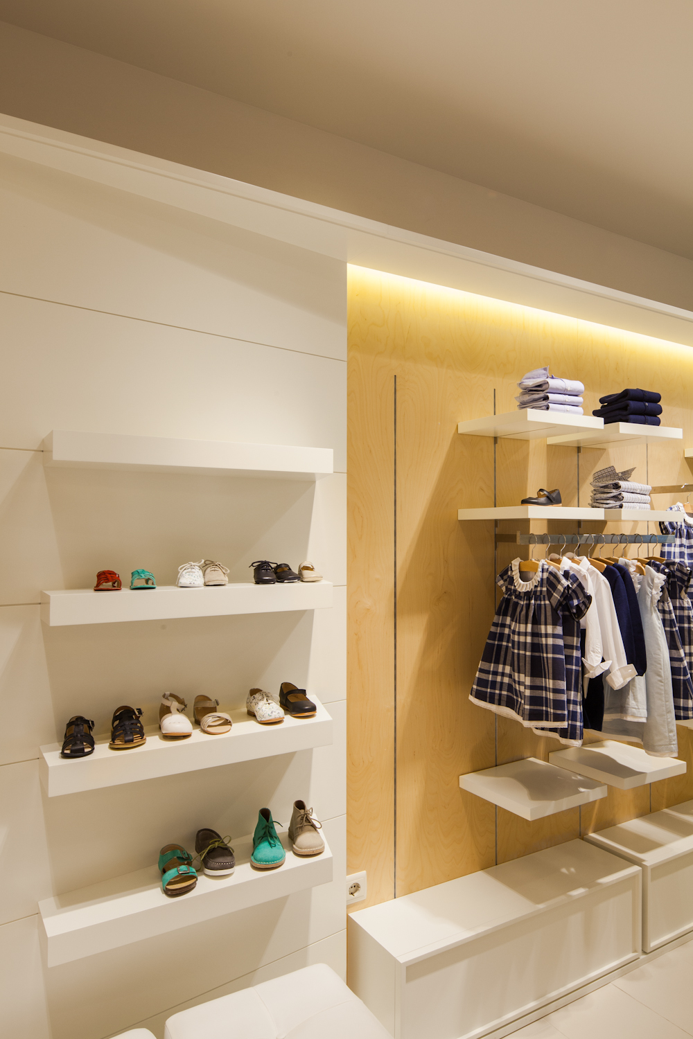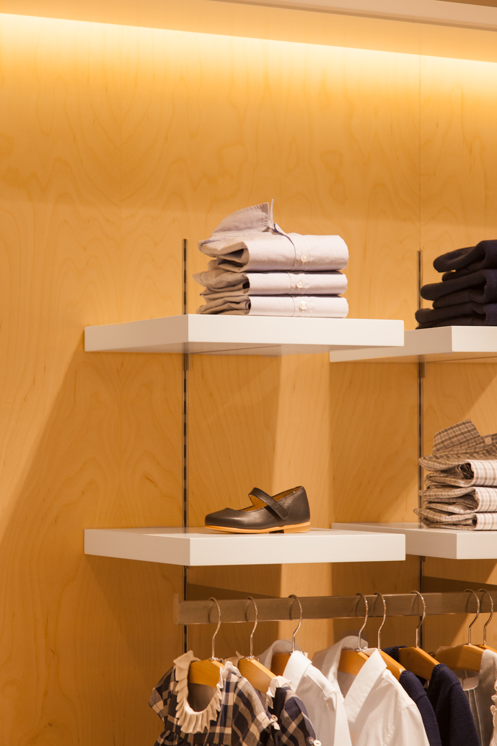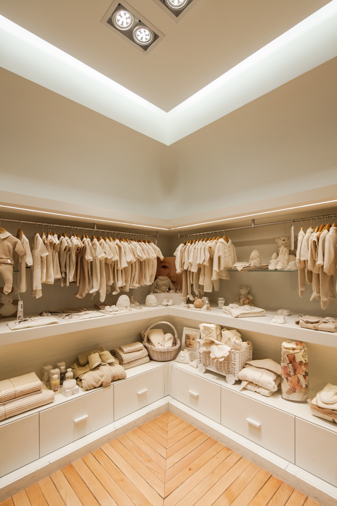
Given that this is a children's clothing store, an assumption of the remodelling project includes the strong association with “children's world,” while applying this criterion to the choice of materials, colours and textures; to the design of the space and of display or complementary furniture.

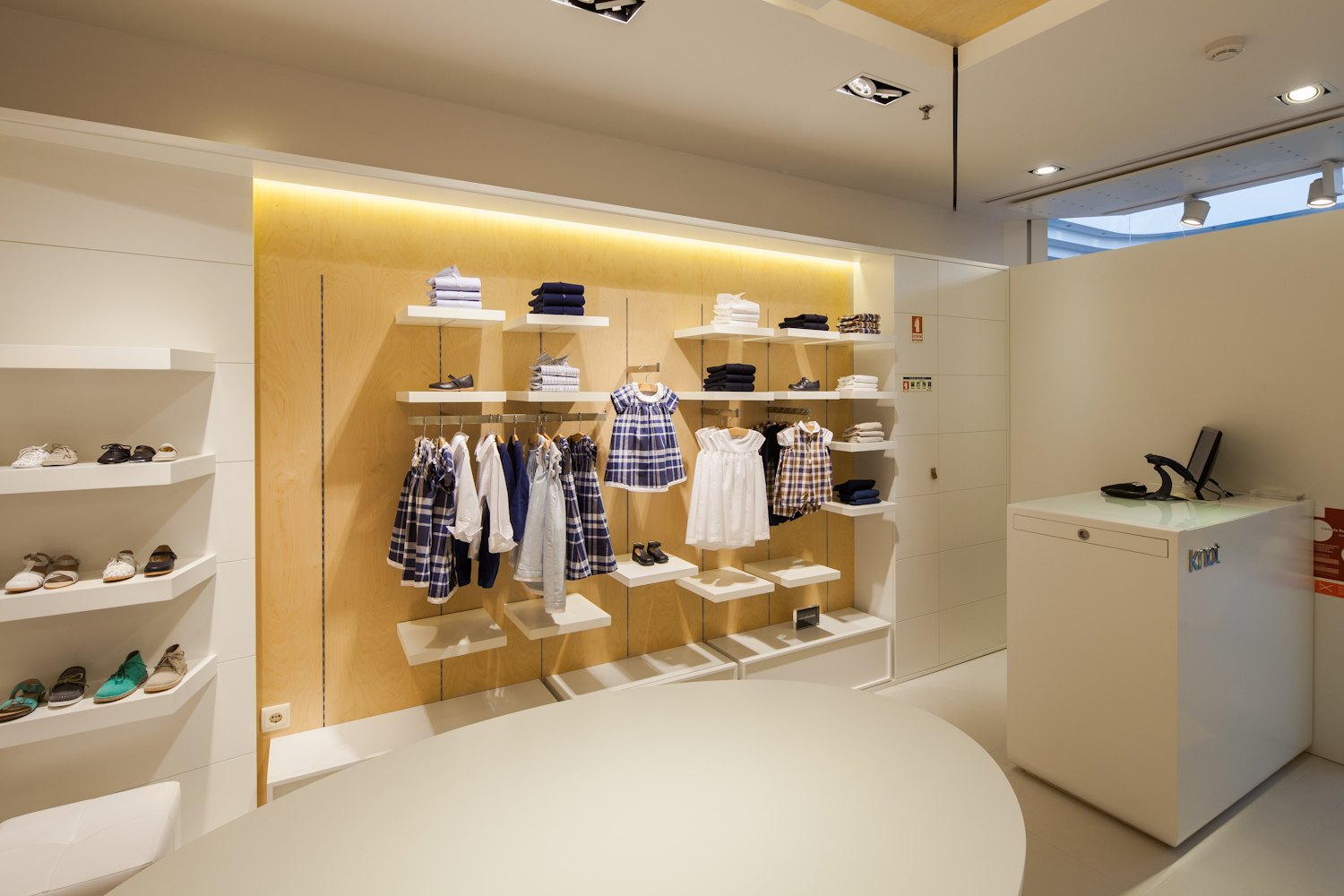
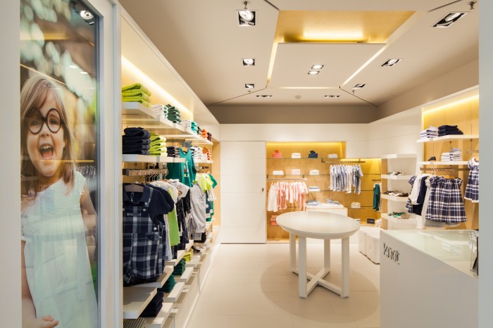
The idea was to convey an image that is exquisite, clean, easy and warm, while seeking to optimize the available display and sales space, by fully assuming the store's perimeter and creating a modular display of fixed elements - closed and open modules, for display and storage, respectively.
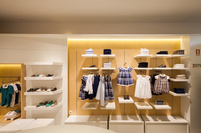
Floor level comprises fun-and-games items intended for children, which seek to make their experience at the “KNOT” venue a rich and pleasant one. The central circulating area is reserved for only two elements - the customer service counter and a complementary display table.

The adopted solution for the store's façade is aimed at the store's transparency relative to the mall, and, using the same simplicity applied to the store's interior design, fitting the lettering “KNOT” in a light box.
